[fusion_builder_container admin_label=”Content” type=”flex” hundred_percent=”no” hundred_percent_height=”no” hundred_percent_height_scroll=”no” align_content=”stretch” flex_align_items=”flex-start” flex_justify_content=”center” flex_wrap=”wrap” flex_column_spacing=”0px” hundred_percent_height_center_content=”yes” equal_height_columns=”no” container_tag=”div” hide_on_mobile=”small-visibility,medium-visibility,large-visibility” status=”published” margin_top=”0px” margin_bottom=”0px” padding_top=”0px” padding_right=”0px” padding_bottom=”0px” padding_left=”0px” border_sizes_top=”0px” border_sizes_right=”0px” border_sizes_bottom=”0px” border_sizes_left=”0px” border_style=”solid” border_radius_top_left=”0px” border_radius_top_right=”0px” border_radius_bottom_right=”0px” border_radius_bottom_left=”0px” box_shadow=”no” box_shadow_blur=”0″ box_shadow_spread=”0″ gradient_start_position=”0″ gradient_end_position=”100″ gradient_type=”linear” radial_direction=”center center” linear_angle=”180″ background_position=”center center” background_repeat=”no-repeat” fade=”no” background_parallax=”none” enable_mobile=”no” parallax_speed=”0.3″ background_blend_mode=”none” background_slider_skip_lazy_loading=”no” background_slider_loop=”yes” background_slider_pause_on_hover=”no” background_slider_slideshow_speed=”5000″ background_slider_animation=”fade” background_slider_direction=”up” background_slider_animation_speed=”800″ video_aspect_ratio=”16:9″ video_loop=”yes” video_mute=”yes” pattern_bg=”none” pattern_bg_style=”default” pattern_bg_opacity=”100″ pattern_bg_blend_mode=”normal” mask_bg=”none” mask_bg_style=”default” mask_bg_opacity=”100″ mask_bg_transform=”left” mask_bg_blend_mode=”normal” absolute=”off” absolute_devices=”small,medium,large” sticky=”off” sticky_devices=”small-visibility,medium-visibility,large-visibility” sticky_transition_offset=”0″ scroll_offset=”0″ animation_direction=”left” animation_speed=”0.3″ animation_delay=”0″ filter_hue=”0″ filter_saturation=”100″ filter_brightness=”100″ filter_contrast=”100″ filter_invert=”0″ filter_sepia=”0″ filter_opacity=”100″ filter_blur=”0″ filter_hue_hover=”0″ filter_saturation_hover=”100″ filter_brightness_hover=”100″ filter_contrast_hover=”100″ filter_invert_hover=”0″ filter_sepia_hover=”0″ filter_opacity_hover=”100″ filter_blur_hover=”0″][fusion_builder_row][fusion_builder_column type=”1_1″ layout=”1_1″ align_self=”auto” content_layout=”column” align_content=”flex-start” valign_content=”flex-start” content_wrap=”wrap” spacing=”yes” center_content=”no” column_tag=”div” target=”_self” hide_on_mobile=”small-visibility,medium-visibility,large-visibility” sticky_display=”normal,sticky” order_medium=”0″ order_small=”0″ spacing_left=”0px” spacing_right=”0px” margin_top=”0px” margin_bottom=”0px” padding_top=”0px” padding_right=”0px” padding_bottom=”0px” padding_left=”0px” hover_type=”none” border_sizes_top=”0px” border_sizes_right=”0px” border_sizes_bottom=”0px” border_sizes_left=”0px” border_style=”solid” border_radius_top_left=”0px” border_radius_top_right=”0px” border_radius_bottom_right=”0px” border_radius_bottom_left=”0px” box_shadow=”no” box_shadow_blur=”0″ box_shadow_spread=”0″ background_type=”single” gradient_start_position=”0″ gradient_end_position=”100″ gradient_type=”linear” radial_direction=”center center” linear_angle=”180″ lazy_load=”avada” background_position=”left top” background_repeat=”no-repeat” background_blend_mode=”none” background_slider_skip_lazy_loading=”no” background_slider_loop=”yes” background_slider_pause_on_hover=”no” background_slider_slideshow_speed=”5000″ background_slider_animation=”fade” background_slider_direction=”up” background_slider_animation_speed=”800″ sticky=”off” sticky_devices=”small-visibility,medium-visibility,large-visibility” absolute=”off” filter_type=”regular” filter_hover_element=”self” filter_hue_hover=”0″ filter_saturation_hover=”100″ filter_brightness_hover=”100″ filter_contrast_hover=”100″ filter_invert_hover=”0″ filter_sepia_hover=”0″ filter_opacity_hover=”100″ filter_blur_hover=”0″ filter_hue=”0″ filter_saturation=”100″ filter_brightness=”100″ filter_contrast=”100″ filter_invert=”0″ filter_sepia=”0″ filter_opacity=”100″ filter_blur=”0″ transform_type=”regular” transform_hover_element=”self” transform_scale_x_hover=”1″ transform_scale_y_hover=”1″ transform_translate_x_hover=”0″ transform_translate_y_hover=”0″ transform_rotate_hover=”0″ transform_skew_x_hover=”0″ transform_skew_y_hover=”0″ transform_scale_x=”1″ transform_scale_y=”1″ transform_translate_x=”0″ transform_translate_y=”0″ transform_rotate=”0″ transform_skew_x=”0″ transform_skew_y=”0″ transition_duration=”300″ transition_easing=”ease” motion_effects=”W10=” scroll_motion_devices=”small-visibility,medium-visibility,large-visibility” animation_direction=”left” animation_speed=”0.3″ animation_delay=”0″ last=”true” border_position=”all” first=”true”][fusion_text hide_on_mobile=”small-visibility,medium-visibility,large-visibility” sticky_display=”normal,sticky” class=”font_17″ animation_direction=”left” animation_speed=”0.3″ animation_delay=”0″]
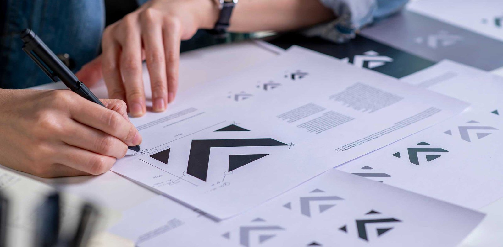
Societal shifts and trends play a massive role in establishing what people find visually compelling. So, we might say that graphic design of any era is a direct reflection of the society it emerges from. From technological advances to fashion and cultural shifts, our daily lives inform these changes. And while new design trends might not be noticeable in the moment, look back to previous decades and it’s easy to place design and style in the era from which it came.
Retro art, inclusivity, bold fonts, high-contrast design, accessibility, color choices, and nature-inspired visuals are just a few of the top design trends in 2025, and that’s what we’ll explore today.
[/fusion_text][fusion_title title_type=”text” loop_animation=”once” marquee_direction=”left” marquee_speed=”15000″ rotation_effect=”bounceIn” display_time=”1200″ highlight_effect=”circle” highlight_width=”9″ highlight_top_margin=”0″ title_link=”off” link_target=”_self” hide_on_mobile=”small-visibility,medium-visibility,large-visibility” sticky_display=”normal,sticky” class=”podkova font_20″ content_align=”left” size=”2″ fusion_font_family_title_font=”Podkova” fusion_font_variant_title_font=”800″ font_size=”20px” line_height=”1.2″ text_color=”var(–awb-color4)” text_shadow=”no” text_shadow_blur=”0″ text_stroke=”no” text_stroke_size=”1″ text_overflow=”none” margin_top_medium=”2px” margin_bottom_medium=”2px” margin_top_small=”2px” margin_bottom_small=”2px” margin_top=”2px” margin_bottom=”2px” gradient_font=”no” gradient_start_position=”0″ gradient_end_position=”100″ gradient_type=”linear” radial_direction=”center center” linear_angle=”180″ style_type=”none” animation_direction=”left” animation_speed=”0.3″ animation_delay=”0″]
Top Five 2025 Graphic Design Trends
[/fusion_title][fusion_text hide_on_mobile=”small-visibility,medium-visibility,large-visibility” sticky_display=”normal,sticky” class=”font_17″ animation_direction=”left” animation_speed=”0.3″ animation_delay=”0″]
Design trends may come and go, but designers and branding professionals know how powerful visuals can be in the effort to resonate deeply with an audience and align with their sensibilities. Here are some of the design trends that have emerged in 2025.
[/fusion_text][fusion_title title_type=”text” loop_animation=”once” marquee_direction=”left” marquee_speed=”15000″ rotation_effect=”bounceIn” display_time=”1200″ highlight_effect=”circle” highlight_width=”9″ highlight_top_margin=”0″ title_link=”off” link_target=”_self” hide_on_mobile=”small-visibility,medium-visibility,large-visibility” sticky_display=”normal,sticky” class=”podkova font_20″ content_align=”left” size=”3″ fusion_font_family_title_font=”Podkova” fusion_font_variant_title_font=”800″ font_size=”20px” line_height=”1.2″ text_color=”var(–awb-color4)” text_shadow=”no” text_shadow_blur=”0″ text_stroke=”no” text_stroke_size=”1″ text_overflow=”none” margin_top_medium=”2px” margin_bottom_medium=”2px” margin_top_small=”2px” margin_bottom_small=”2px” margin_top=”2px” margin_bottom=”2px” gradient_font=”no” gradient_start_position=”0″ gradient_end_position=”100″ gradient_type=”linear” radial_direction=”center center” linear_angle=”180″ style_type=”none” animation_direction=”left” animation_speed=”0.3″ animation_delay=”0″]Retro Pixel Art in Design[/fusion_title][fusion_text hide_on_mobile=”small-visibility,medium-visibility,large-visibility” sticky_display=”normal,sticky” class=”font_17″ animation_direction=”left” animation_speed=”0.3″ animation_delay=”0″]Retro pixel art has enjoyed a resurgence in recent years, capturing the early days of digital art with a retro charm that appeals to audiences ever more enamored with nostalgia, especially in the gaming community.
Pixel art emerged in the late 70s and early 80s and continued to evolve into the 90s, pushing the boundaries of digital storytelling despite the medium’s constraints.
In applying pixel art to modern design, artists must embrace the constraints. A limited color palette, embracing the pixel grid, and generally keeping the design as simple as possible are the keys to producing pixel art that achieves its goal: to create branding, web design, and digital media that celebrates the past and sparks the imagination.[/fusion_text][fusion_title title_type=”text” loop_animation=”once” marquee_direction=”left” marquee_speed=”15000″ rotation_effect=”bounceIn” display_time=”1200″ highlight_effect=”circle” highlight_width=”9″ highlight_top_margin=”0″ title_link=”off” link_target=”_self” hide_on_mobile=”small-visibility,medium-visibility,large-visibility” sticky_display=”normal,sticky” class=”podkova font_20″ content_align=”left” size=”3″ fusion_font_family_title_font=”Podkova” fusion_font_variant_title_font=”800″ font_size=”20px” line_height=”1.2″ text_color=”var(–awb-color4)” text_shadow=”no” text_shadow_blur=”0″ text_stroke=”no” text_stroke_size=”1″ text_overflow=”none” margin_top_medium=”2px” margin_bottom_medium=”2px” margin_top_small=”2px” margin_bottom_small=”2px” margin_top=”2px” margin_bottom=”2px” gradient_font=”no” gradient_start_position=”0″ gradient_end_position=”100″ gradient_type=”linear” radial_direction=”center center” linear_angle=”180″ style_type=”none” animation_direction=”left” animation_speed=”0.3″ animation_delay=”0″]Inclusive Visuals in Graphic Design[/fusion_title][fusion_text hide_on_mobile=”small-visibility,medium-visibility,large-visibility” sticky_display=”normal,sticky” class=”font_17″ animation_direction=”left” animation_speed=”0.3″ animation_delay=”0″]
There is a growing emphasis on diversity and diverse representation in graphic design, and this trend is likely to endure. Inclusive design refers to making visuals representative of many types of people: men, women, children, and people of all colors, cultures, and abilities. By including inclusive visuals in marketing materials, websites, and social media, brands express their commitment to cultural expression and demonstrate authenticity, as this is what our world looks like.
In best practice, inclusive visuals should reflect the diversity of the brand’s customer base and workforce. Authenticity is key, but the imagery must go beyond tokenism to be truly authentic. It’s not just about ticking a box. The visuals should tell a story, evoke emotions, and consider the cultural contexts where they will be seen.
Avoid promoting cultural stereotypes, consider using user-generated content, and keep people with disabilities in mind. Inclusivity also refers to accessibility. For example, using alt-text and a high-contrast color palette may help people with visual impairments.
[/fusion_text][fusion_title title_type=”text” loop_animation=”once” marquee_direction=”left” marquee_speed=”15000″ rotation_effect=”bounceIn” display_time=”1200″ highlight_effect=”circle” highlight_width=”9″ highlight_top_margin=”0″ title_link=”off” link_target=”_self” hide_on_mobile=”small-visibility,medium-visibility,large-visibility” sticky_display=”normal,sticky” class=”podkova font_20″ content_align=”left” size=”3″ fusion_font_family_title_font=”Podkova” fusion_font_variant_title_font=”800″ font_size=”20px” line_height=”1.2″ text_color=”var(–awb-color4)” text_shadow=”no” text_shadow_blur=”0″ text_stroke=”no” text_stroke_size=”1″ text_overflow=”none” margin_top_medium=”2px” margin_bottom_medium=”2px” margin_top_small=”2px” margin_bottom_small=”2px” margin_top=”2px” margin_bottom=”2px” gradient_font=”no” gradient_start_position=”0″ gradient_end_position=”100″ gradient_type=”linear” radial_direction=”center center” linear_angle=”180″ style_type=”none” animation_direction=”left” animation_speed=”0.3″ animation_delay=”0″]High Contrast and Bold Typography[/fusion_title][fusion_text hide_on_mobile=”small-visibility,medium-visibility,large-visibility” sticky_display=”normal,sticky” class=”font_17″ animation_direction=”left” animation_speed=”0.3″ animation_delay=”0″]
Using high-contrast text and bold typography is an excellent way to capture attention and convey messages with design. High contrast can also make text easier to read, such as a bold white font on a black background—simple but impactful.
Bold typography for branding can help emphasize keywords and phrases, convey emotion, and inform how people perceive the content. Designers can use these typography trends to create a visual hierarchy within the layout to guide the reader through the text while highlighting key elements in the copy.
Using contrasting font colors and sizes can also enhance readability and significantly improve the design experience for people with learning differences, ultimately helping brands reach broader audiences and promoting a more equitable digital experience.
[/fusion_text][fusion_title title_type=”text” loop_animation=”once” marquee_direction=”left” marquee_speed=”15000″ rotation_effect=”bounceIn” display_time=”1200″ highlight_effect=”circle” highlight_width=”9″ highlight_top_margin=”0″ title_link=”off” link_target=”_self” hide_on_mobile=”small-visibility,medium-visibility,large-visibility” sticky_display=”normal,sticky” class=”podkova font_20″ content_align=”left” size=”3″ fusion_font_family_title_font=”Podkova” fusion_font_variant_title_font=”800″ font_size=”20px” line_height=”1.2″ text_color=”var(–awb-color4)” text_shadow=”no” text_shadow_blur=”0″ text_stroke=”no” text_stroke_size=”1″ text_overflow=”none” margin_top_medium=”2px” margin_bottom_medium=”2px” margin_top_small=”2px” margin_bottom_small=”2px” margin_top=”2px” margin_bottom=”2px” gradient_font=”no” gradient_start_position=”0″ gradient_end_position=”100″ gradient_type=”linear” radial_direction=”center center” linear_angle=”180″ style_type=”none” animation_direction=”left” animation_speed=”0.3″ animation_delay=”0″]Accessible Color Combinations[/fusion_title][fusion_text hide_on_mobile=”small-visibility,medium-visibility,large-visibility” sticky_display=”normal,sticky” class=”font_17″ animation_direction=”left” animation_speed=”0.3″ animation_delay=”0″]
Color combinations have great importance to accessibility in graphic design. Good contrast between foreground and background is essential to ensure visually impaired people can read, understand, and recognize information conveyed in the digital content. Better readability may expand the audience as the content will be accessible to more people.
The Americans with Disabilities Act (ADA) and Web Content Accessibility Guidelines (WCAG) outline standards for digital accessibility, including the use of color and pattern. The guidelines indicate a minimum color contrast ratio of 4.5:1 for normal text and 3:1 for larger text. With the right contrast, websites and content are more navigable, resulting in a better user experience.
Using an online tool to check color contrast takes the guesswork out of designing for accessibility and supports digital compliance under the ADA.
[/fusion_text][fusion_title title_type=”text” loop_animation=”once” marquee_direction=”left” marquee_speed=”15000″ rotation_effect=”bounceIn” display_time=”1200″ highlight_effect=”circle” highlight_width=”9″ highlight_top_margin=”0″ title_link=”off” link_target=”_self” hide_on_mobile=”small-visibility,medium-visibility,large-visibility” sticky_display=”normal,sticky” class=”podkova font_20″ content_align=”left” size=”3″ fusion_font_family_title_font=”Podkova” fusion_font_variant_title_font=”800″ font_size=”20px” line_height=”1.2″ text_color=”var(–awb-color4)” text_shadow=”no” text_shadow_blur=”0″ text_stroke=”no” text_stroke_size=”1″ text_overflow=”none” margin_top_medium=”2px” margin_bottom_medium=”2px” margin_top_small=”2px” margin_bottom_small=”2px” margin_top=”2px” margin_bottom=”2px” gradient_font=”no” gradient_start_position=”0″ gradient_end_position=”100″ gradient_type=”linear” radial_direction=”center center” linear_angle=”180″ style_type=”none” animation_direction=”left” animation_speed=”0.3″ animation_delay=”0″]Nature-Inspired Aesthetics[/fusion_title][fusion_text hide_on_mobile=”small-visibility,medium-visibility,large-visibility” sticky_display=”normal,sticky” class=”font_17″ animation_direction=”left” animation_speed=”0.3″ animation_delay=”0″]Nature-inspired graphic design is closely linked to the strong trend toward sustainability and eco-friendly, earth-first design choices. Consumers today are drawn to brands strongly focused on a greener future.
Using nature-inspired, tactile textures, visuals, and colors transports the viewer into nature and evokes an emotional, sensory response beyond the visual itself. The best examples of this are often quite subtle, like stone finishes, wood textures, botanical design, and organic shapes with imperfect or asymmetrical lines.
We’re tapping into a primal place grounded in Mother Nature: natural textures, colors found in nature, and organic shapes can be compelling from a design perspective as they signal the brand’s values and show that it cares about sustainability and environmental preservation.[/fusion_text][fusion_title title_type=”text” loop_animation=”once” marquee_direction=”left” marquee_speed=”15000″ rotation_effect=”bounceIn” display_time=”1200″ highlight_effect=”circle” highlight_width=”9″ highlight_top_margin=”0″ title_link=”off” link_target=”_self” hide_on_mobile=”small-visibility,medium-visibility,large-visibility” sticky_display=”normal,sticky” class=”podkova font_20″ content_align=”left” size=”4″ fusion_font_family_title_font=”Podkova” fusion_font_variant_title_font=”800″ font_size=”20px” line_height=”1.2″ text_color=”var(–awb-color4)” text_shadow=”no” text_shadow_blur=”0″ text_stroke=”no” text_stroke_size=”1″ text_overflow=”none” margin_top_medium=”2px” margin_bottom_medium=”2px” margin_top_small=”2px” margin_bottom_small=”2px” margin_top=”2px” margin_bottom=”2px” gradient_font=”no” gradient_start_position=”0″ gradient_end_position=”100″ gradient_type=”linear” radial_direction=”center center” linear_angle=”180″ style_type=”none” animation_direction=”left” animation_speed=”0.3″ animation_delay=”0″]
Final Thoughts
[/fusion_title][fusion_text hide_on_mobile=”small-visibility,medium-visibility,large-visibility” sticky_display=”normal,sticky” class=”font_17″ animation_direction=”left” animation_speed=”0.3″ animation_delay=”0″]
Wrapping up, the latest trends in digital design are highly reflective of the cultural and societal shifts we are experiencing in our daily lives. From the nostalgia of retro pixel art to embracing cultural awareness, diversity, and inclusion and the strong focus on accessible design, the most impactful graphic design in 2025 will resonate with today’s values.
Though these are just a handful of design trends we apply to branding at Costello Creative Group, we are always looking ahead to anticipate what might be on the horizon. Emerging trends we may see more of in the future include greater emphasis on immersive and 3D design, augmented reality (AR), virtual reality (VR), and a continuing evolution of how we use AI to support design workflows. We expect to see a growing trend toward retrofuturism, experimental font choices, and heatmapping to increase conversions.
We invite you to experiment with these trends in your own projects, and we’re always here to provide guidance and friendly design advice when needed. Talk to us today, and find out what’s possible.
[/fusion_text][/fusion_builder_column][/fusion_builder_row][/fusion_builder_container]